Startup
Making car-buying decisions easier with data.
Shipping a data-driven report feature with multiple data sources.
Overview
Problem
The YAA (Your Auto Advocate) YouTube channel had thousands of weekly viewers with a single goal: learn insider secrets on how to buy a car at the best price.
The popular media channel drove a high amount of traffic to the YAA marketing site, missing a key opportunity to convert viewers into free members.
Solution
Implemented vehicle listings with search and filtering functionality to convert media channel viewers into free members, as measured by number of signups.
Impact
After a late Q4 launch, Q1 - Q2 2022 nearly doubled the amount of weekly unique vehicle listings visitors.
The number of free signups also doubled. Free to paid members was consistent in the same timeframe, averaging 0.5%

CarEdge (formerly YAA) is a seed-stage startup with a goal of empowering consumers to get the best deal when buying a car. It ranks among the top 50 automotive websites, with a media presence that generates millions of monthly views.
Role & Responsibilities
As a freelance Product Designer, I was tasked with:
UX/UI design and prototyping.
Establishing a design system.
Conducting evaluative research.
Post-launch, I joined as Head of Product Design.
Project Team
Timeline
3 months (initial launch)
Technology
Marketcheck API
Approach
Initial release
This project focused on iterative development: starting with basic functionality for initial release and making enhancements based on user feedback, technical capabilities, and increased resources.
Core experience for vehicle listings consisted of:
Search Entry (Home Page)
Search Results (Listings / Filtering / Sorting)
Vehicle Detail Page
Business goals
YAA was focused on acquisition of free members, and driving signups from vehicle listings. Vehicle listings were heavily promoted from YouTube and other YAA social media platforms. Throughout the vehicle listings experience, banners promoted YAA membership, and vehicle detail pages drove towards signup.
User flow for search and content structure for messaging. View full Figjam here.
Overcoming challenges
The project's early stages were marked by significant challenges, requiring flexibility and problem-solving to move forward.
Industry & timing challenges
At the time, the auto industry experienced significant supply chain disruptions, affecting car availability and pricing. This presented a unique challenge: encouraging users to subscribe to a premium service in a market without significant discounts.
Vehicle listings launched in mid-December, a peak time for car sales and web traffic. However, squashing bugs led us into the new year, a slow period for the industry, impacting our leverage of December's high traffic.
Team & process challenges
Team Expansion: The addition of an offshore development team introduced logistical challenges due to a 10-hour time difference.
Development vs. Design: The team initiated development before finalizing design.
Process Establishment: The dev team had just started implementing JIRA boards and standardizing sprint processes.
QA Processes: Absence of a structured QA process and dedicated team.
Experience
This section shows the iteration of vehicle listings post-launch, focusing on user interface enhancements and visual improvements. Shortly after listings I brought on a contract UX/Visual Designer for a site-wide brand refresh, including vehicle listings.
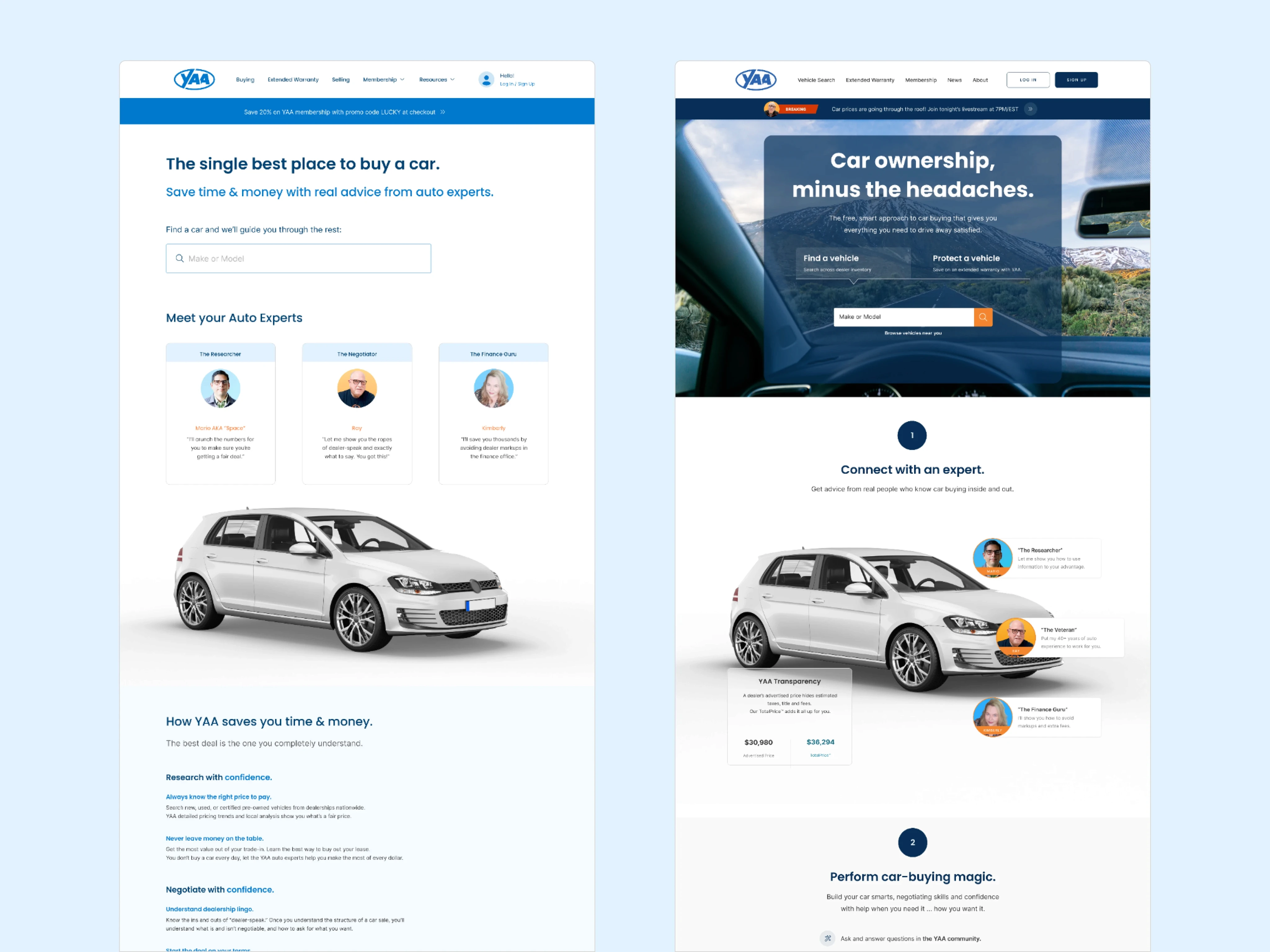
Two versions of search entry on homepage.
Search entry
The main entry point for vehicle listings was the home page.
We encountered challenges with autocomplete model selection due to inconsistencies in Marketcheck data—for instance, "Toyota RAV4" appearing as two separate entries due to case sensitivity. We deferred this issue for future updates.
The homepage messaging changed frequently, to test value proposition messaging.
Search results
Data inconsistencies required flexibility: null states, missing information, and other variations. Initially, we aimed for uniformity by masking dealer "chrome" in car photos (phone numbers, flames, and other graphic embellishment, only to learn users appreciated these authentic details.
Filter panel
Enhancements to the filter panel introduced a more intuitive push interaction, as seen in the video above. Mobile filtering used a fixed button to apply filters and return to results, while results automatically updated on desktop.
We streamlined facet choices by consolidating the less-common facets. Slider controls snapped to set increments to minimize API calls.
User feedback revealed nomenclature confusion around the term “Totalprice” - I learned we shouldn’t be clever, and reverted to the “Out-the-Door Price” for consistency with the rest of the site.
Next iterations
Increasing team efficiency
A full-time Senior UX Designer joined in Q1, tasked with further refining and expanding the search feature.
Refining features
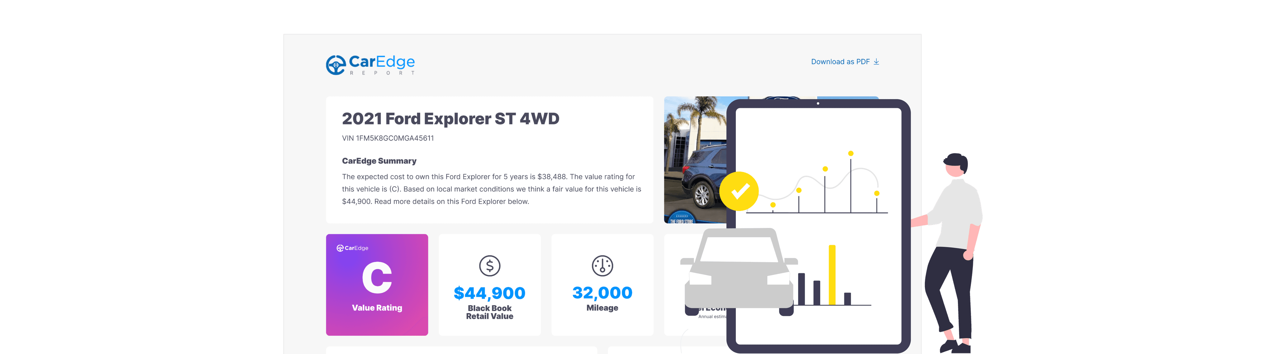
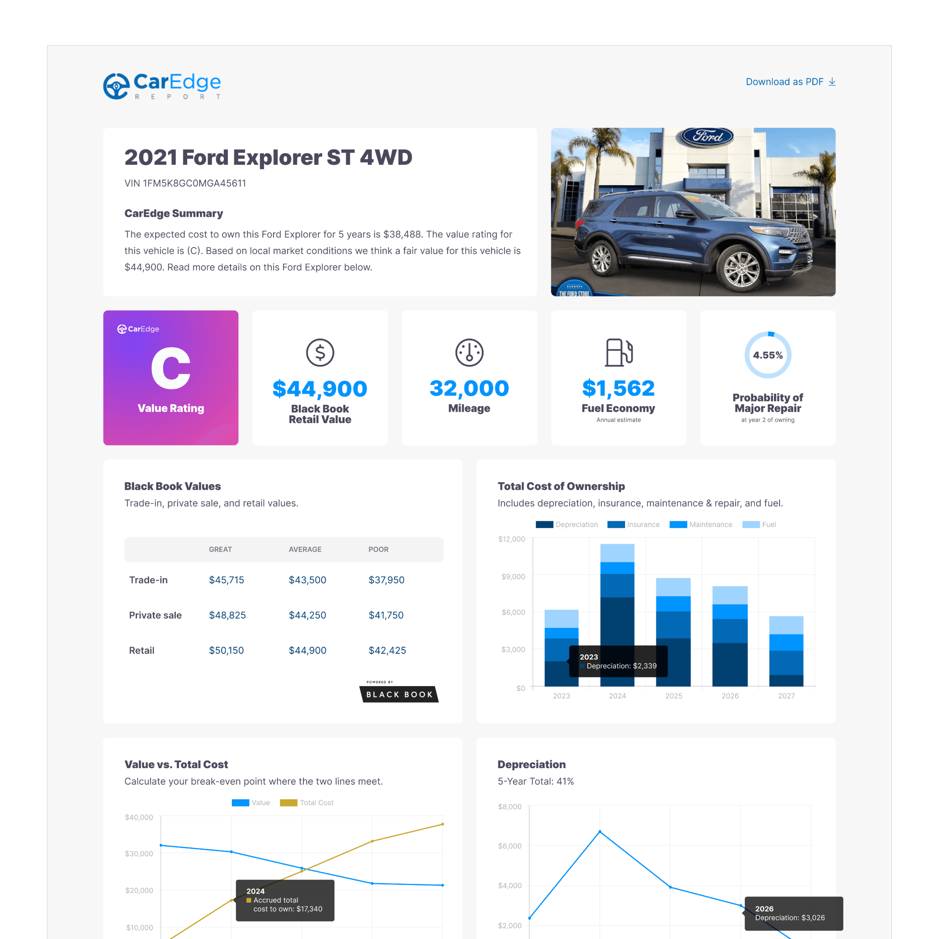
Future iterations included adding favorites and saved search, as well as laying the groundwork for the CarEdge Fair Price Report (in Q3 YAA officially became CarEdge).
Overcoming technical constraints
A key technical challenge was the separation of vehicle listings (wrapped within a Wordpress site) from the member Python app, hindering user recognition. We addressed this issue in a subsequent re-platforming by integrating the listings directly into the app.
