Director of User Experience
Helping doctors focus on practicing medicine, not marketing.
Redesigning and re-platforming 100+ physician web sites to reduce launch time and streamline maintenance.
Overview
Problem
As Privia Medical Group expanded their network to add more practices, physician marketing web sites became more inefficient: visual and navigation inconsistencies and inaccurate content.
These issues complicated the launch and ongoing maintenance for staff and developers, highlighting an opportunity for efficiency improvements.
Solution
Developed a centrally-managed network of sites for over 100 diverse physician practices.
Established workflows for efficient site launches and maintenance.
Defined and filled two direct roles to streamline operations.
Impact
Reduced site time-to-launch and streamlined maintenance.
Improved patient engagement with online tools, increasing portal use and appointment bookings.

Privia Health is a nationwide physician practice management and population health technology company.
Role & Responsibilities
As Director of UX, I was responsible for:
Leading decision-making.
Conducting stakeholder communication.
Managing key workstreams.
Hiring new positions.
Providing creative direction.
Planning information architecture and site modules.
Project Team
Timeline
Approach
Initial challenges
Physician web sites at Privia were reliant on a single template that didn't accommodate the diverse needs of various practices. This led to:
- A lack of uniformity, with many practices opting out of the standard template in favor of their own design solutions, causing inconsistency in appearance and navigation.
- The absence of a single source of truth for content, resulting in publishing unvetted or inaccurate information.
- Critical patient resources, such as portal access and online appointment scheduling, were not universally accessible or prominently featured.
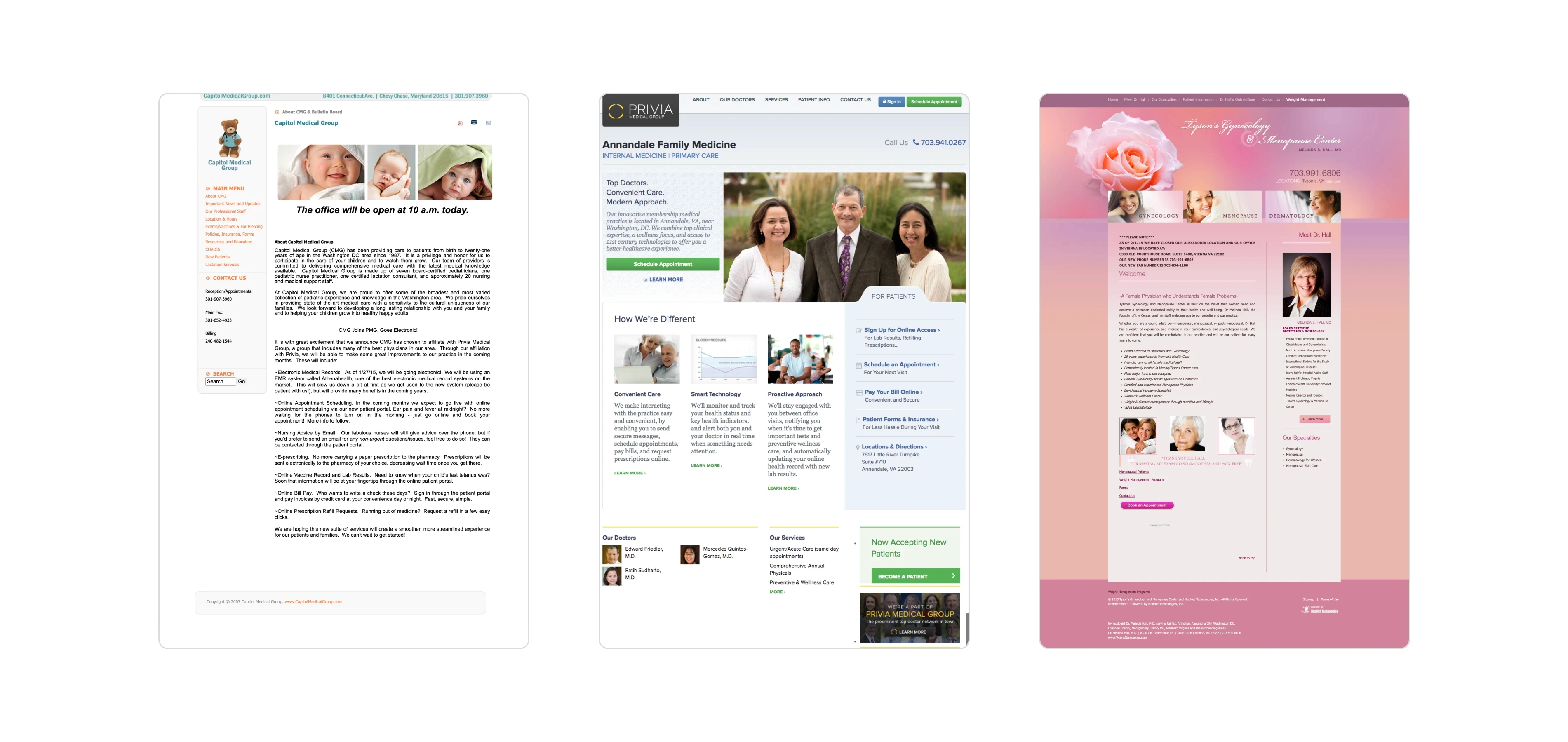
Privia physician web sites, before.
Maintenance
The existing template also posed significant operational challenges, particularly in:
Promptly communicating emergency notices (e.g., weather closures), making administrative updates (e.g., changing office hours), or announcing seasonal health reminders (e.g., flu shots).
The lack of a dedicated contact for making updates led to inefficiencies and delays. As primary liasions between Privia and physicians, Implementation Managers (IMs) and Performance Consultants (PCs) were frequently preoccupied with pressing issues.
User task flow and information architecture deliverables.
Pausing to realign
This was a cross-functional project between marketing and technology. I led the project, and work was divided between departments, with VP of Technology and Marketing weighing in and helping the team navigate issues. A freelance UX/visual designer joined the team as well.
Strategic pause
With buy-in from leadership, we temporarily froze web site development for 30 days. This strategic pause allowed our team to formulate a solution and timeline. For efficiency we divided into specialized subteams focusing on design, process & content, and systems.
Balancing cohesion with autonomy
Our primary goal was to balance uniformity across the Privia network while preserving the unique identity of each physician practice. This involved:
Centralizing site management within Privia for uniform oversight.
Ensuring consistent information presentation across all sites.
Facilitating easy updates across multiple sites, such as seasonal flu shot reminders.
Patient insights
Design decisions were influenced by recent discovery interviews I conducted regarding user behaviors and preferences when searching for doctors.
Information architecture
For shared functionalities like the Patient Portal and online appointments, I conducted a thorough review of Privia's site ecosystem, aiming to streamline and standardize navigation across the board.

This 2x2 grid categorized types of physician practices.
Design workstream
Categorization
Understanding that practices varied significantly, a categorized system was introduced to effectively guide design and deployment.
I developed a 2x2 grid, based on:
1. Size of practice
Defined by the number of providers (including physicians, nurse practitioners, and physician assistants) and number of locations.
2. Complexity of practice
Defined by the type of services offered; primary care vs complicated specialties like cardiology.
Each practice was assigned a category, which defined our approach to templating and site rollout schedule.
Phased rollout
The project unfolded in three phases to manage complexity and implementation scale:
Test Phase
Initiated with a select group of supportive care centers to test the concept across various sizes and specialties.
Pilot Phase
Expanded to include sites that presented unique challenges under the initial template (”tough customers”)
Go-Live Phase
Applied the refined process to all practices, methodically tackling the existing backlog and ensuring every practice was accounted for in the new system.
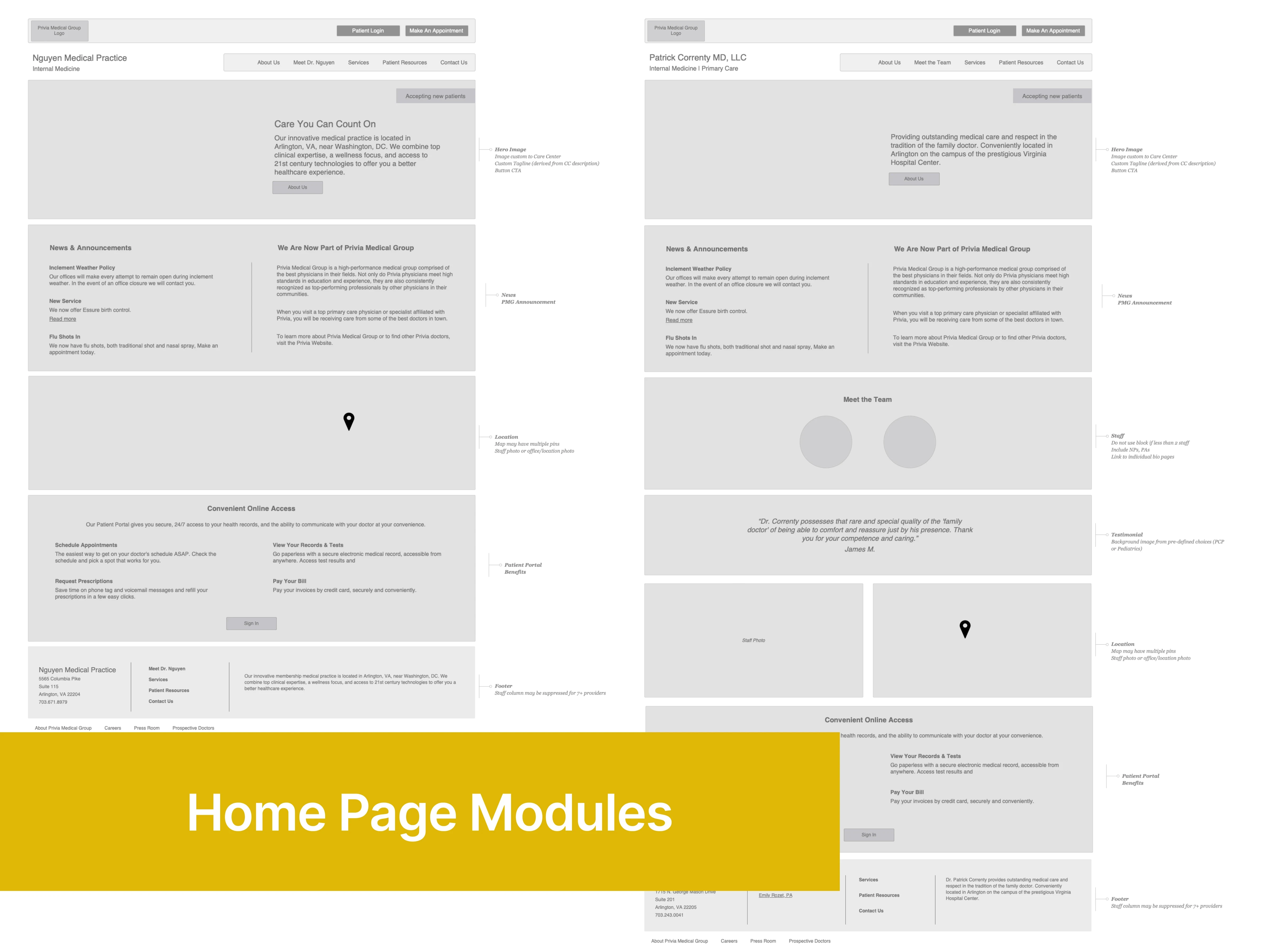
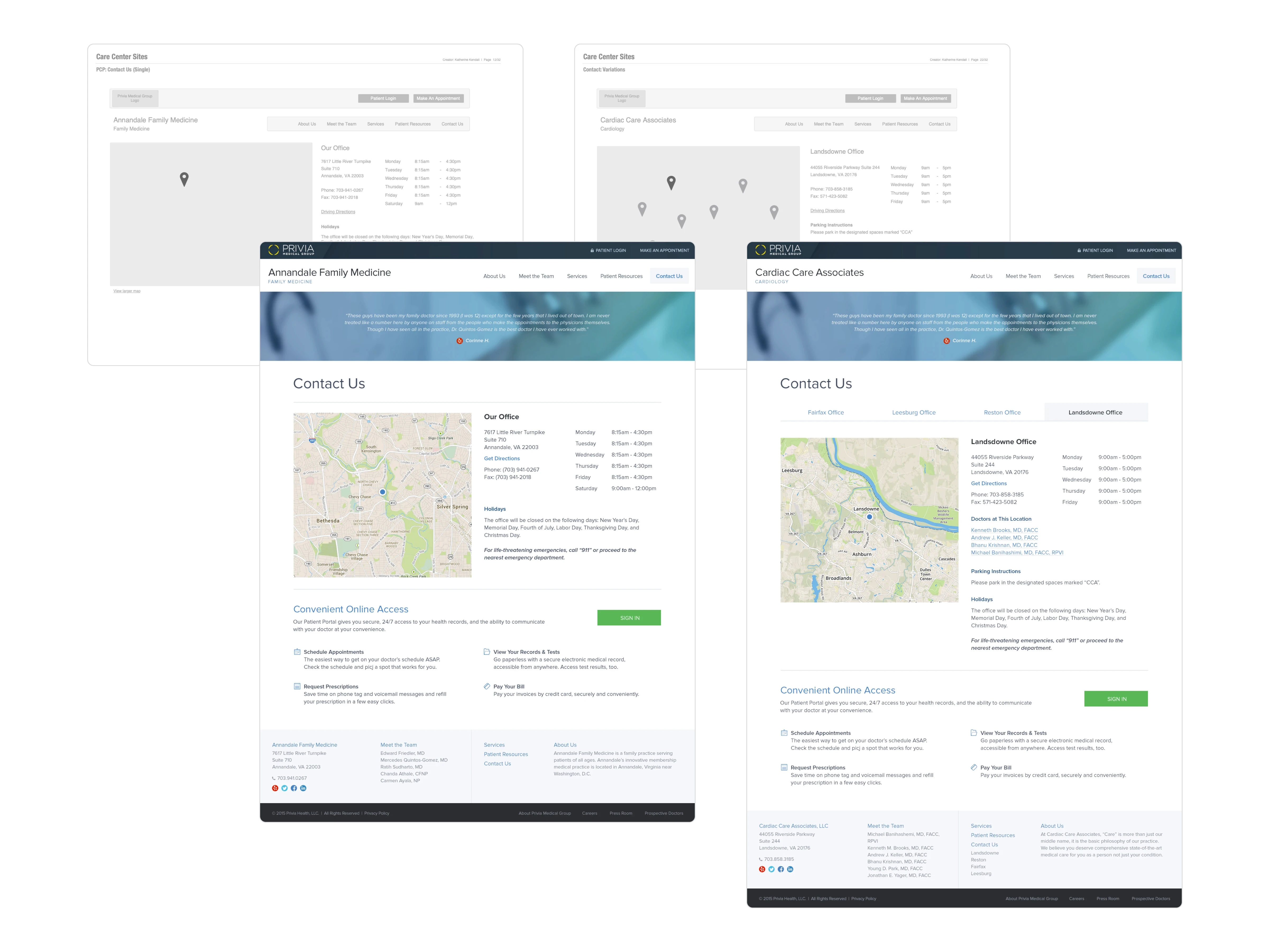
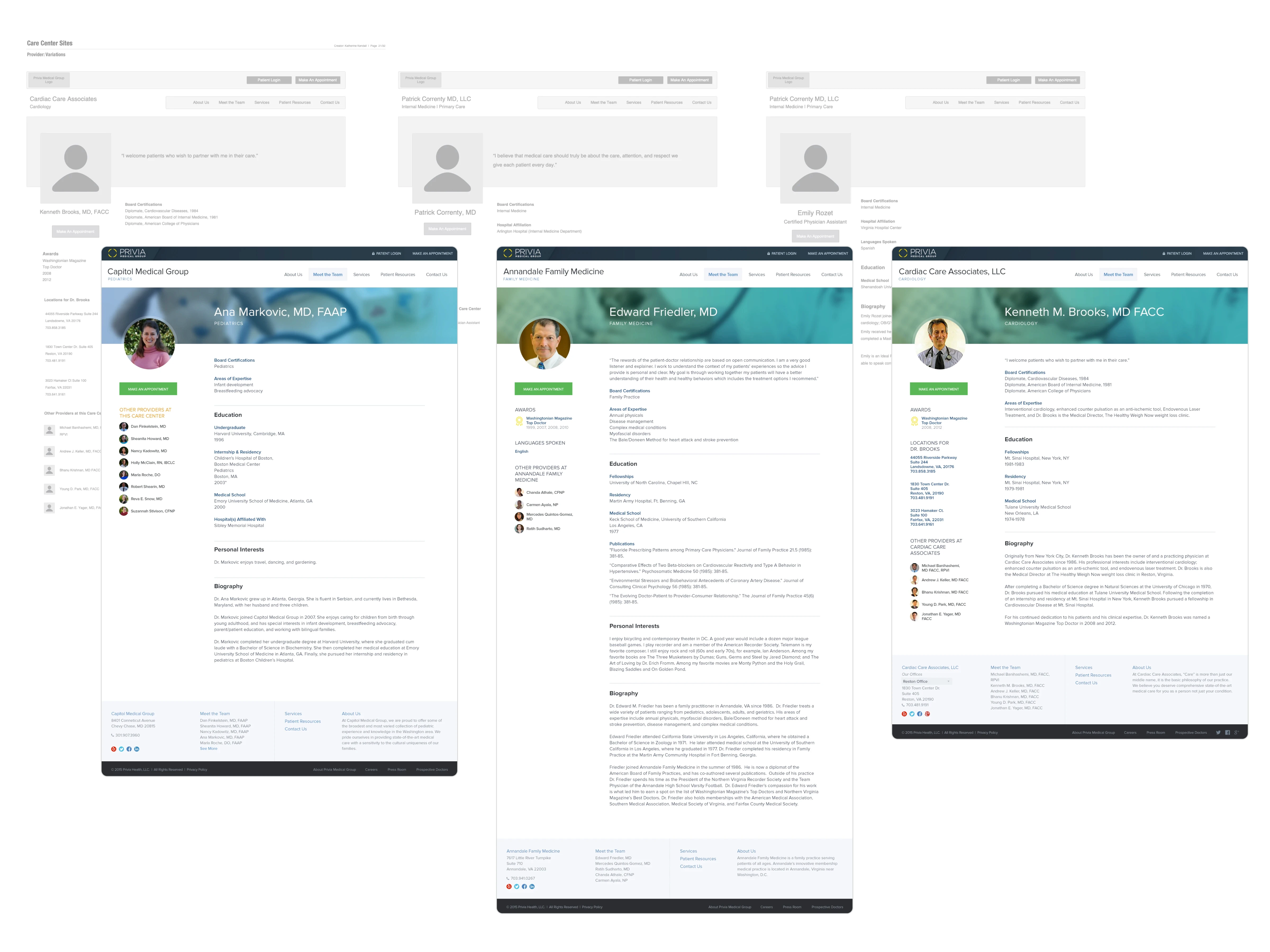
Sets of components and variations across physician sites.
Modular solution
We adopted a component-based approach. This strategy used modular elements adaptable to each practice's classification, ensuring flexibility and consistency.

Photography for personalization
A key aspect of bringing each practice's unique personality to the forefront was through photography. The design team compiled a range of hero image options, allowing practices to select imagery that best represented their identity or opt for a carefully selected default image if preferred.
Process & content workstream
Gather the right information
The process and content team initiated a content inventory for launched practices, establishing a source of truth and addressing content gaps.
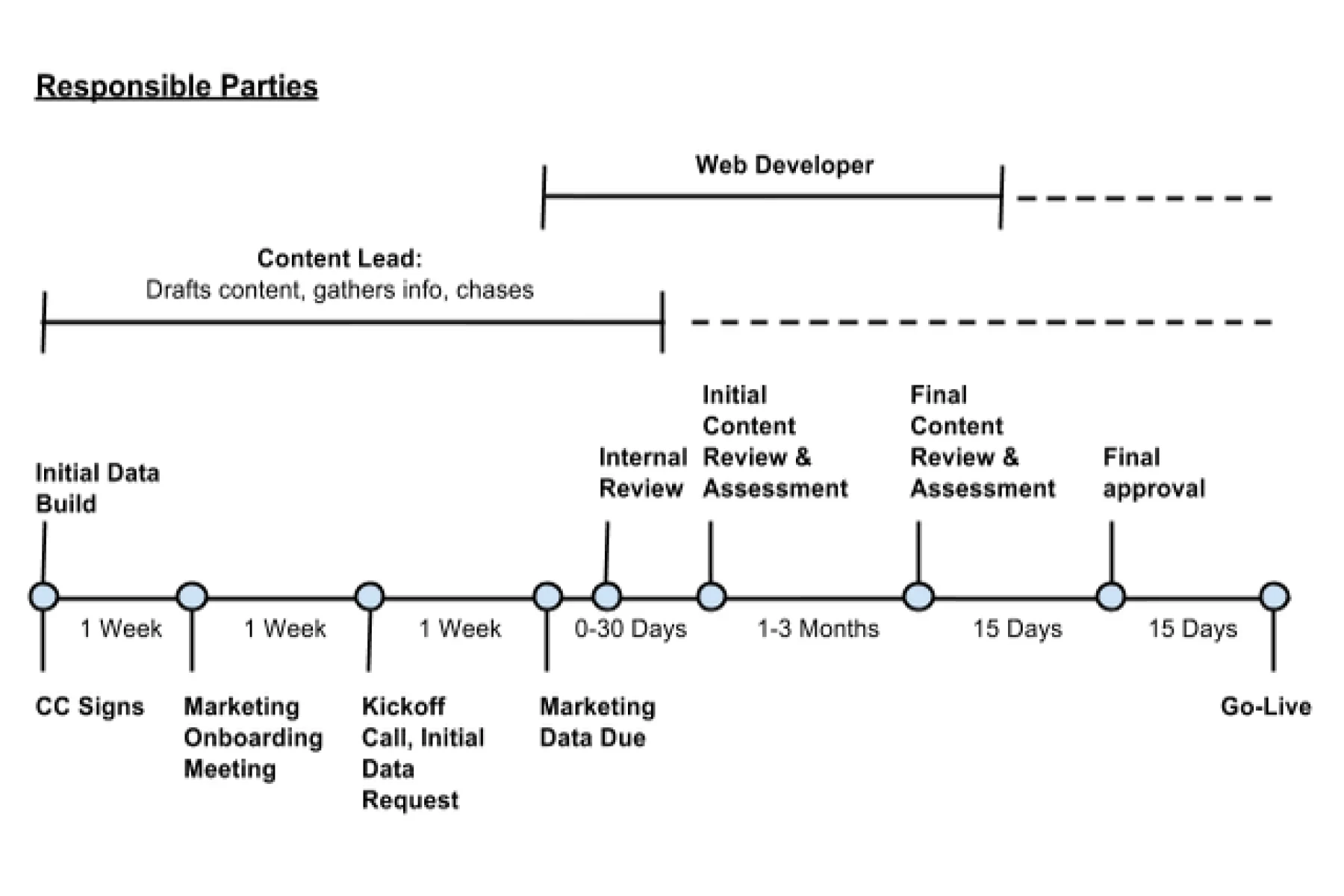
Timeline and responsibilities for site launch.
Reduce time to implement sites
We identified a new role, Content Lead, who would act as a single contact point to gather content and manage the review process, working closely with the Web Developer.
Post-launch, the Content Lead would be responsible for making updates based on physician requests, and communicate out any changes initiated by Privia.
Systems & people workstream
I hired a Web Developer to focus solely on the new platform; we ultimately ended up using centrally-managed Wordpress.
Initially, we decided to manage changes internally through process and the Content Lead, instead of turning over publishing to physician staff.
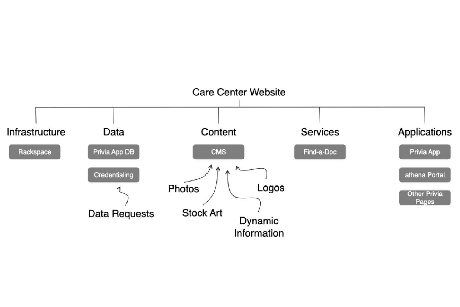
Technical diagram of sites.
Communication & feedback
To gather feedback from practices, I coordinated on-site visits with Implementation Managers and Performance Consultants. This approach reinforced our commitment to listening to and incorporating their feedback, and provided valuable face-to-face engagement.
For internal communications, we hosted lunch and learn sessions to share the project's rationale, design decisions, and implementation timelines.

Key learnings
Champion the vision.
Securing both internal and external buy-in was essential, achieved through regular, transparent communication—such as 'Lunch and Learn' sessions and direct interactions with physicians.
Collaboration with Implementation Managers and Performance Consultants significantly smoothed communication with physicians, reinforcing our commitment to understanding and addressing their needs.
Prioritize early adopters.
Initial efforts to persuade resistant care centers during the pilot phase introduced delays. These challenges often reflected broader issues with Privia rather than specific objections to the web site redesign.
Recognizing this, we moved forward with those who were receptive, planning to revisit the skeptics later.


